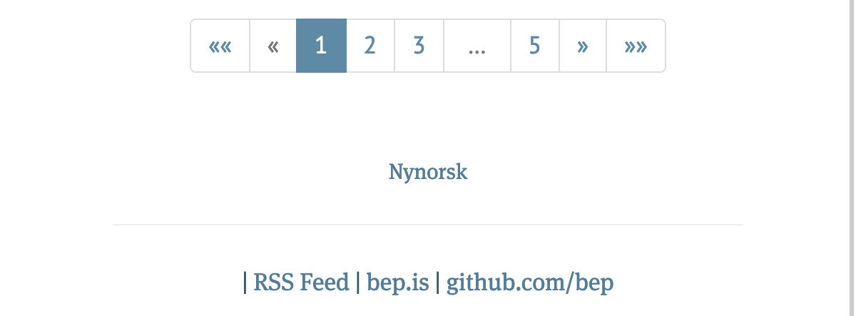
I recently stumbled across a now deleted post on the Fediverse and having voted myself I was quite surprised by the answers. It seemed as if the majority was clearly wrong. Most people were saying they would expect older posts to be to the left.
In my mind, it very logically didn’t make sense at all. Clearly, the older posts should be to the right, the newer ones to the left (as in the time starts at the left). By this poll, I am however in the minority, and there appears to be a strong tendency towards the left.
Luckily, I didn’t yet have to implement pagination on this blog1, so I couldn’t see what I had decided on here.
What do the blogging people2 do
I started off, by looking at some blogs I regularly read.

I first checked out Troy Hunt’s blog and was mostly surprised by how many pages he has on his blog. I guess he has been blogging for a long time. And as we can see, he has older posts to the right.
Current tally: Right 1, Left 0


Next I checked out Bryce Wray’s blog as well as Bjørn Erik Pedersen’s blog, which by the way uses a hilariously outdated version of Hugo3.
Current tally: Right 3, Left 0
I also checked out David Smith’s blog, but he just has a huge list of all his posts in an archive. Smart move, this means you don’t need to care about pagination.
So what about newspapers
I also wanted to see some newspapers. The Guardian doesn’t have any pagination (at least not that I found). It mostly uses autoloading or just a button that loads more articles4. The same goes for The Washington Post. So the big newspapers have mostly moved away from pagination or older and newer articles, but they rather have load-on-scroll or load-on-click mechanisms.

The New York Times has some pagination, although limited to 10 pages. But also there, older pages are to the right. This is albeit much less strong than the forward and backwards, but higher pages are to the right and they also have the older posts.
Current tally: Right 4, Left 0
I looked at some more newspapers, but it is mostly automatically loading more posts on scroll. I haven’t actually found any examples of having older posts to the left.
So what do we do with this very unscientific data
This has been a very unscientific, non-comprehensive look at the pagination issue. I did find it very interesting that in the poll (also not very scientific) the majority, about two thirds of the respondents, have a differing opinion to the prevailing navigation method I found.
So in case I ever get to (or more likely have to) build pagination or navigation to this blog, I’m going to build it in such a way I was planning to anyway. Older posts to the right. Newer posts to the left.
This is one of these statements that is currently correct, but may not be correct forever. Depending on how this goes, I will have to add pagination at some point to this blog. I really dearly hope this is not too soon, as I feel all kinds of design challenges that will arrive for this. Hopefully, my posting rhythm of once a week will keep me spared for a bit. ↩︎
By that, I mean people that blog. Are they called blogsters? Blog writers? Blogeneers? I don’t know. ↩︎
I mean, this is just funny because Pedersen is one of the if not the main developer of Hugo, but his blog runs on Hugo v0.54. But I guess he’s busy developing new features for Hugo instead of writing a blog. And since this is a static site, there is no security disadvantage to have an outdated version. ↩︎
Also at the time of writing, the more articles button fails for me because of a CORS header. (Might be me though, I have lots of ad blocking and similar add-ons.) ↩︎