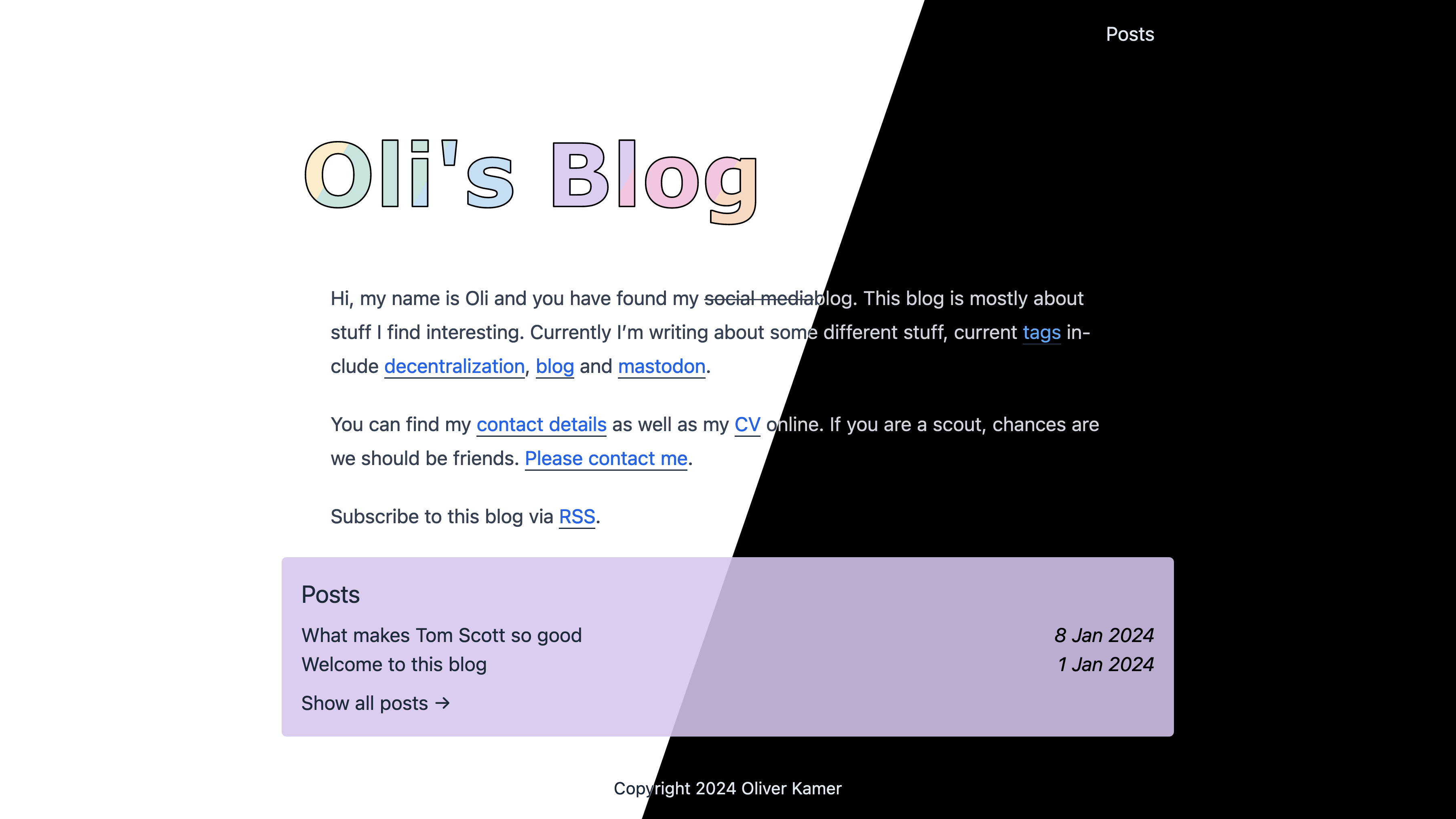
Too long, don’t want to read it1: This blog now has dark mode, which is automatic. Also, this might be a short blog post.
As a developer, I’m supposed to have a strong preference for the dark mode. After all, most developers use a dark development environment2. However, I don’t have that strong of an opinion. I use mostly whatever is available. For example, on my laptop and my phone, I just have them set to the automatic setting. If it is dark outside, it is in dark mode, and if it is bright, it is in light mode, easy enough.

How is this done
My blog, being a static website, is not actually aware if you have dark mode enabled on your device or not. That makes sense so far. I also don’t want to send you a different code depending on whether you have dark mode enabled or not. Luckily, there is a straightforward solution: prefers-color-scheme3. This feature is both available in HTML and CSS, but for my styling requirements, CSS is really the more appropriate solution. As such, it is a pretty easy task.
body {
    background: white;
    color: black;
}
@media (prefers-color-scheme: dark) {
    body {
        background: black;
        color: white;
    }
}
Well, as I mentioned in my blog post before before, I don’t just use raw CSS, but rather my own special blend of SCSS and Tailwind CSS. And actually, using Tailwind CSS, it is even simpler. Instead of having to use this prefers-color-scheme shebang, I can just use a normal Tailwind CSS utility classes, but prefixed with dark:. So the code from above effortlessly becomes the following:
body {
    @apply bg-white dark:bg-black text-black dark:text-white;
}
I think this is why I like Tailwind CSS so much; it makes some stuff – like dark mode – just so easy to implement. A simple prefix, and that’s it.
Okay – dark mode – what’s the big deal?
This all – my blog having dark mode – is nothing special, but if you are one of those people who prefers to read on their phone late at night, now you will not be blinded anymore when you open up the browser on this page. And using this CSS method, there is also no FOUC, unlike some pages4.
Maybe it’s even saving some power or something on OLED, but no promises on my part, though.
This is my take on TL;DR. Although I should also mention that you might be at the wrong place if you don’t want to read, as this is a blog – you know for reading. ↩︎
The CSS feature is, of course, well described on MDN. ↩︎
YouTube? Why are you doing this? ↩︎